> ## Documentation Index
> Fetch the complete documentation index at: https://cometchat-22654f5b-docs-audit-content-webhooks.mintlify.site/llms.txt
> Use this file to discover all available pages before exploring further.
# Customizing Your UI Kit Builder
> Customize Next.js UI Kit Builder components by adjusting CometChat app props, styling, group messages, and behavior.
The `CometChatSettings.ts` file handles basic feature toggles. For deeper customizations, modify component props or source code directly.
The exported code uses the [React UI Kit](/ui-kit/react/overview), so every
React UI Kit component, prop, and customization layer applies here. In
Next.js, any file that renders these components or calls the CometChat SDK
must be a Client Component — add `"use client";` as the first line, and keep
it inside the SSR-disabled boundary set up in the
[Integration Guide](/chat-builder/nextjs/integration). The `chatUser` variable
in the examples below is a `CometChat.User` you fetch from the SDK, as shown
in the next section.
***
## **Getting a `chatUser` Reference**
Several examples below pass a `chatUser` prop. This is a `CometChat.User` object
you fetch from the SDK after login. Fetch it in a Client Component with
`CometChat.getUser()`:
```tsx lines theme={null}
"use client";
import { useEffect, useState } from "react";
import { CometChat } from "@cometchat/chat-sdk-javascript";
function useChatUser(uid: string) {
const [chatUser, setChatUser] = useState();
useEffect(() => {
CometChat.getUser(uid).then((user) => setChatUser(user));
}, [uid]);
return chatUser;
}
```
Render the component only once `chatUser` is defined, for example
`chatUser ? : null`. The same applies
to a `group` prop fetched with `CometChat.getGroup()`.
***
## **App-Level Customizations**
These ready-to-use props on the `CometChatApp` component let you quickly adjust common behaviors without modifying any internal components.
### **Group Action Messages**
Control the visibility of group action messages using the `showGroupActionMessages` prop:
```jsx theme={null}
```
* `true` (default) — Group action messages are **visible**
* `false` — Group action messages are **hidden**
### **Auto Open First Item**
Control whether the first item in lists automatically opens on render using the `autoOpenFirstItem` prop:
```jsx theme={null}
```
* `true` (default) — The first item in conversation list, user list, or group list opens automatically on first render
* `false` — No item opens until the user clicks on one
***
## **Component-Level Customizations**
For more advanced customizations tailored to your app's needs, you can modify individual UI Kit components directly.
### **How to Customize**
1. Find the component in the [UI Kit Components Overview](/ui-kit/react/components-overview)
2. Check available props and customization options
3. Update props or edit the component source code
Below are some examples to help you get started with common customizations like date formats, conversation subtitles, and send buttons.
### **Custom Date Format**
Customize how sticky date headers appear in the message list.
**Component**: [Message List](/ui-kit/react/message-list) → [`stickyDateTimeFormat`](/ui-kit/react/message-list#sticky-datetime-format)
```jsx lines theme={null}
"use client";
import {
CometChatMessageList,
CalendarObject,
} from "@cometchat/chat-uikit-react";
const dateFormat = new CalendarObject({
today: "hh:mm A", // "10:30 AM"
yesterday: "[Yesterday]",
otherDays: "DD/MM/YYYY", // "25/05/2025"
});
;
```
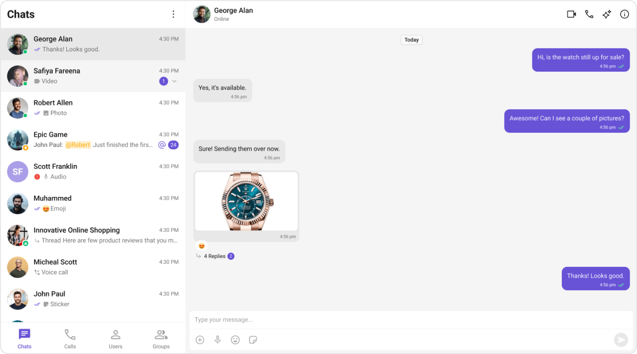 **Default format** (for reference):
```javascript lines theme={null}
new CalendarObject({
today: "today",
yesterday: "yesterday",
otherDays: "DD MMM, YYYY", // "25 Jan, 2025"
});
```
***
### **Custom Conversation Subtitle**
Show online status or member count instead of the default last message preview.
**Component**: [Conversations](/ui-kit/react/conversations) → [`subtitleView`](/ui-kit/react/conversations#subtitleview)
```jsx lines theme={null}
"use client";
import { CometChat } from "@cometchat/chat-sdk-javascript";
import { CometChatConversations } from "@cometchat/chat-uikit-react";
const customSubtitleView = (conversation) => {
if (conversation.getConversationType() === "user") {
const user = conversation.getConversationWith();
return (
{user.getStatus() === "online" ? "🟢 Online" : "⚫ Offline"}
);
} else {
const group = conversation.getConversationWith();
return {group.getMembersCount()} members;
}
};
;
```
***
### **Custom Send Button**
Replace the default send button with your brand's icon.
**Component**: [Message Composer](/ui-kit/react/message-composer) → [`sendButtonView`](/ui-kit/react/message-composer#sendbuttonview)
```jsx lines theme={null}
"use client";
import {
CometChatMessageComposer,
CometChatButton,
} from "@cometchat/chat-uikit-react";
const brandedSendButton = (
{
// Your custom send logic
}}
/>
);
;
```
```css lines theme={null}
/* Style the custom send button */
.cometchat-message-composer .cometchat-button {
background: #6852d6;
border-radius: 50%;
}
.cometchat-message-composer .cometchat-button__icon {
background: #ffffff;
}
```
***
## **Customization Layers**
Component props are one of several ways to tailor the exported chat. Each layer
operates independently, so you can combine them:
| Layer | What it changes | Where |
| ---------------------------- | ------------------------------------------------------------ | --------------------------------------------------------------- |
| Feature toggles | Enable/disable features | [`CometChatSettings.ts`](/chat-builder/nextjs/builder-settings) |
| Component props & slot views | Per-component behavior and custom views (the examples above) | [Components Overview](/ui-kit/react/components-overview) |
| Message templates | How individual message bubbles render | [Message Template](/ui-kit/react/message-template) |
| Theme overrides | Colors, fonts, dark mode via the theme system | [Theming](/ui-kit/react/theme) |
| CSS variables | Fine-grained styling via `--cometchat-*` tokens | [Color Resources](/ui-kit/react/theme/color-resources) |
***
## **Next Steps**
Configure feature toggles and behavior
Explore all available UI components
Customize how message bubbles render
Customize colors, typography, and styling
Override `--cometchat-*` design tokens
Add multi-language support
**Default format** (for reference):
```javascript lines theme={null}
new CalendarObject({
today: "today",
yesterday: "yesterday",
otherDays: "DD MMM, YYYY", // "25 Jan, 2025"
});
```
***
### **Custom Conversation Subtitle**
Show online status or member count instead of the default last message preview.
**Component**: [Conversations](/ui-kit/react/conversations) → [`subtitleView`](/ui-kit/react/conversations#subtitleview)
```jsx lines theme={null}
"use client";
import { CometChat } from "@cometchat/chat-sdk-javascript";
import { CometChatConversations } from "@cometchat/chat-uikit-react";
const customSubtitleView = (conversation) => {
if (conversation.getConversationType() === "user") {
const user = conversation.getConversationWith();
return (
{user.getStatus() === "online" ? "🟢 Online" : "⚫ Offline"}
);
} else {
const group = conversation.getConversationWith();
return {group.getMembersCount()} members;
}
};
;
```
***
### **Custom Send Button**
Replace the default send button with your brand's icon.
**Component**: [Message Composer](/ui-kit/react/message-composer) → [`sendButtonView`](/ui-kit/react/message-composer#sendbuttonview)
```jsx lines theme={null}
"use client";
import {
CometChatMessageComposer,
CometChatButton,
} from "@cometchat/chat-uikit-react";
const brandedSendButton = (
{
// Your custom send logic
}}
/>
);
;
```
```css lines theme={null}
/* Style the custom send button */
.cometchat-message-composer .cometchat-button {
background: #6852d6;
border-radius: 50%;
}
.cometchat-message-composer .cometchat-button__icon {
background: #ffffff;
}
```
***
## **Customization Layers**
Component props are one of several ways to tailor the exported chat. Each layer
operates independently, so you can combine them:
| Layer | What it changes | Where |
| ---------------------------- | ------------------------------------------------------------ | --------------------------------------------------------------- |
| Feature toggles | Enable/disable features | [`CometChatSettings.ts`](/chat-builder/nextjs/builder-settings) |
| Component props & slot views | Per-component behavior and custom views (the examples above) | [Components Overview](/ui-kit/react/components-overview) |
| Message templates | How individual message bubbles render | [Message Template](/ui-kit/react/message-template) |
| Theme overrides | Colors, fonts, dark mode via the theme system | [Theming](/ui-kit/react/theme) |
| CSS variables | Fine-grained styling via `--cometchat-*` tokens | [Color Resources](/ui-kit/react/theme/color-resources) |
***
## **Next Steps**
Configure feature toggles and behavior
Explore all available UI components
Customize how message bubbles render
Customize colors, typography, and styling
Override `--cometchat-*` design tokens
Add multi-language support